Apr 12, 2026
The machine that refuses to be perfect
Born from postwar scarcity, the Risograph turned constraint into character.
Apr 12, 2026
Born from postwar scarcity, the Risograph turned constraint into character.
I found Riso by accident. It was 2017—I was hunting for somewhere to print black-and-white photographs for my exhibition, and I walked into the wrong kind of print shop.
The shop was small and warm, walls thick with printed work—posters, zines, test sheets pinned everywhere. There was a smell I couldn‘t quite place: something between a stationery store and a mechanic‘s workshop. Fresh soy-based ink, I later learned. It gets into everything.
We didn‘t end up printing my photos on a Riso. But the owner showed me a stack of fresh samples and talked me through the machine with the kind of enthusiasm that only comes from genuine obsession.
The Risograph occupies a strange middle ground. It looks like a photocopier. It behaves like a screen printer. And it thinks like neither.
The process begins with a Master—a thin rice-paper stencil burned with your artwork, wrapped around an ink drum. Liquid soy-based ink passes through the perforations and onto uncoated paper below. When the job is done, the Master is discarded. It can‘t be reused.
Every print run is, in that sense, a one-time event—a mechanical performance that leaves a trace and then disappears.
The ink compounds this impermanence. Thick and oil-based, it doesn‘t fuse with the paper the way laser toner does. It sits on the surface, technically dry but never fully committed. You can smudge a finished Riso print with your thumb. You can lift ink off with an eraser.
The object you‘re holding is still, in some small way, in progress.
That idea resonates with me as a digital designer. We don‘t really do finality either—we iterate, revisit, ship and revise. The Riso just makes that quality visible, physical, impossible to ignore.
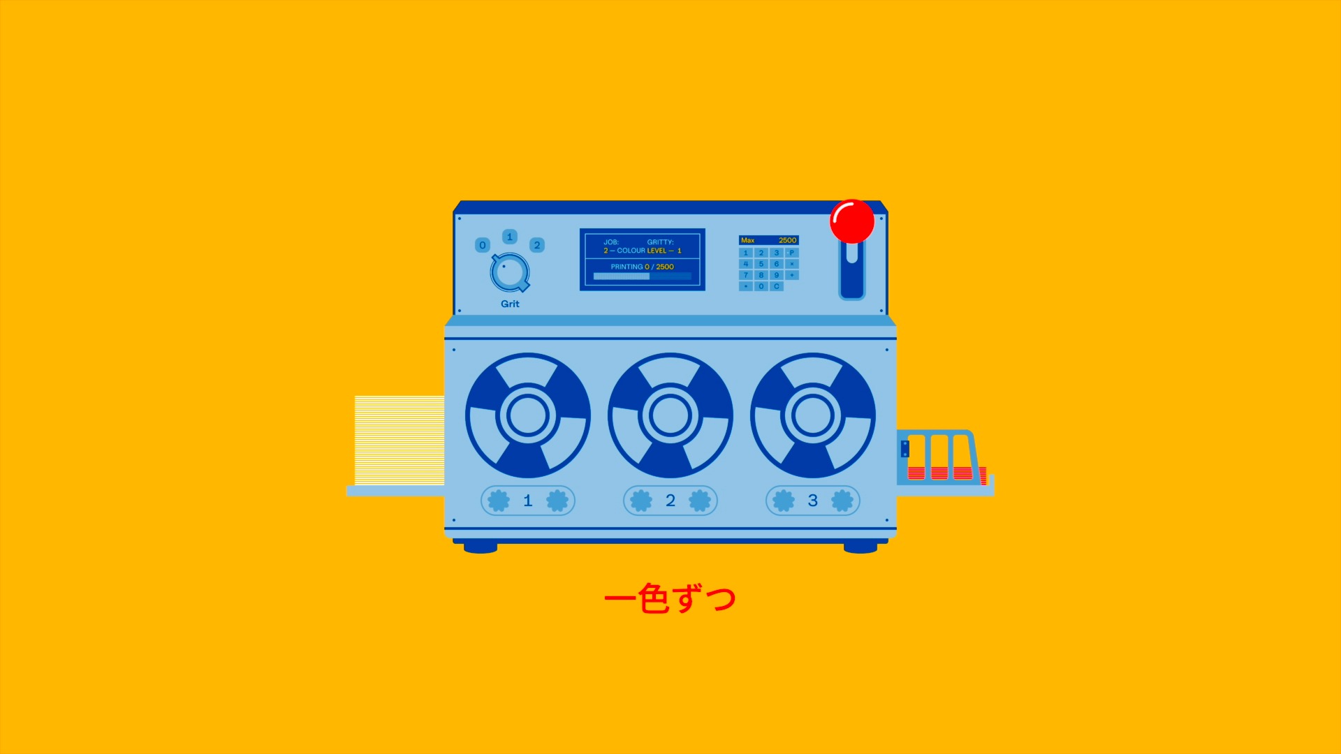
Multi-colour Riso printing requires passing the same sheet through the machine multiple times—once per colour drum. And paper, being paper, shifts. Not dramatically. Just enough.
The result is what printers call misregistration: a subtle misalignment between colour layers, a ghosting at the edges, a blur where two inks meet and don‘t quite agree.
The remarkable thing is that Riso artists don‘t fight this. They design around it. There‘s a technique called trapping—extending colour slightly beyond outlines so that any shift is absorbed rather than exposed. The machine‘s imprecision becomes a collaborator with its own opinions.
The best Riso work carries the evidence of its own making. The registration drift, the ink variation, the unexpected colour where two translucent layers overlap. It‘s a record of a process, not just an outcome.
Riso doesn‘t use conventional CMYK. The palette swaps Magenta for Fluorescent Pink and works with a fixed set of ink drums. Because the inks are translucent, colour mixing happens optically on the page—fifty percent Blue over fifty percent Pink yields a purple that neither ink could produce alone.
It‘s closer to painting than printing.
When depth is needed but a black drum isn‘t available, designers reach for a workaround: duplicate the K channel from the source file and lay it over the other colours using Multiply blend mode. It‘s a hack, technically. But it works—and the fact that it works through constraint rather than capability feels entirely appropriate for this medium.
The detail that stopped me mid-research: RISO means “ideal” in Japanese.
Noboru Hayama founded the company in 1946, in the difficult years after the war, when imported emulsion ink was too expensive for the schools and offices that needed it most. He developed a soy-based alternative. He named the company after the belief that ideals matter most precisely when circumstances make them hardest to hold.
A printing technology named after optimism. I kept returning to that.
Everything I learned—the translucent layering, the registration drift, the limited palette, the ink that never quite dries—kept pointing back to the same question: could I simulate the feeling of this in a browser?
So I built RIKO(cha). You can simply drag in your artwork, choose your ink layers, choose your paper, watch them interact. No machine, no Masters, no roller-mark disasters on a second pass. Just the aesthetic logic of Riso printing, running in a tab.
PS. This is not affiliated with Riso Kagaku Corporation—just a curious designer playing with code over a weekend.
Try it → riko.bykocha.com
Thanks for reading, until next time.
(ノ◕ヮ◕)ノ*:・゚✧
Kocha
© 8888 Kocha · Sydney-Based Designer
I acknowledge the traditional owners of Australia, on whose land I live and work. I pay my respect to their people—past, present and emerging.


Subscribe to my occasional newsletter